Even if we don’t yet have a name for it, development of iBank for iPad has been on going for over a year now. In an earlier post I talked about some of the design decisions and metaphors used for iBank for iPad. There is one in particular that is relevant to the short tour I’m about to give of iBank for iPad:
You can think of it as having your own personal financial report on your iPad. If you sat down with a financial planner who asked a series of comprehensive questions to get a handle on your finances, what you would walk away with would be like our iPad app — your complete financial picture, always up-to-date.
The screenshots you are about to see are not polished and not final. Some still contain debugging code and some have pretty poor formatting, so please ignore this for now. For this post I want to offer of a broad overview; future posts will delve into specifics of its functionality.
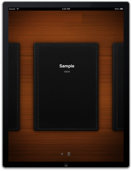
So without further ado, here is one of the first screens you’ll see in iBank for iPad.
In this screen you can see we’ve embraced a “portfolio on a desk” metaphor. Each portfolio is an iBank document, and so yes: this app will support multiple documents (unlike iBank Mobile). A swipe gesture lets you browse the documents, the + button creates a new one, and the trash icon deletes the centered document. When you press the + button, you are taken to a modal “assistant” that walks you through document setup. Tapping one of the leather bound portfolios opens it to reveal the “document home screen”:
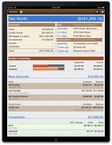
The Document Home Screen is the heads-up display (HUD) for your financial life. Everything you wanted to know is here. The idea is that you are looking at a financial report that is on “magical paper” — with binding on top (which conveniently acts as a toolbar). The paper can expand in size to accommodate users with lots of accounts and it responds to various touch gestures including dynamic interactions. At the top of the page you’ll notice there are two boxes: summary information for all classes of finances, and to the right of that, your upcoming bills and notifications. You’ll also see that all of your accounts are listed and grouped into general categories: “Bank Accounts,” “Investments,” “Mortgages and Loans,” etc.
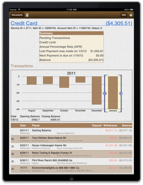
Touching the various elements causes a new sheet of paper to slide in from the right. For example, if you tap “Credit Card” the new “sheet of paper” that slides in shows the details for that account:
Although it isn’t evident in this screenshot, the selection on the bar chart drives the transaction list below. So if you wanted to see transactions from September to November you would select that range in the chart. To edit a transaction, you simply tap it, and to get back to the Document Home View, you just swipe the page to the right to make it go away. (You can ignore the debugging info at the top of the page — as I said, these screens aren’t polished.)
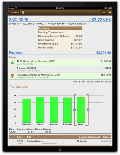
From the Document Home Screen, if you select an investment account a new piece of paper slides in, but we customize what is displayed to emphasize the investments in the account.
Notice on this screen the Positions table (but ignore that temporary green color used in the bars). Here you have an overview of how each of your investments is doing. Tapping a position slides in a new sheet showing additional details of the specified security along with a list of all transactions associated with the security in the account.
So that is a brief overview of iBank for iPad. I haven’t shown all of the screens as I want to save some goodies for the next post. But this should give you a pretty good sense of how this app will work and how to navigate through it.
-Ian
- Filed Away Forever: Why We Built The Organizer - April 25, 2025
- Banktivity 9.5 and Monthly Subscriptions - October 18, 2024
- Coming soon: Banktivity 9.5 - July 19, 2024


Ian,
I applaud your progress thus far! I have been an iBank user since 2008 and have enjoyed the software. I recently obtained an iPad so this app is one I am really looking forward too. I know you mentioned that there were other screens/features to show in later posts, but I want to put in my vote for a Budget screen with Budgeted…Actual…Remaining columns. I would also love to be able to enter split and scheduled transactions.
Lastly, will iBank for Mac and iBank for iPad sync via iCloud or Dropbox? I use Dropbox to sync my iMac and MacBook now, adding my iPad would be great!
Great stuff Ian (and team), thanks for sharing. I cannot believe how excited I am for this, almost feel weird. But being a long time iBank user and using the mobile app several times a day I cannot wait to use this on our iPad’s.
Love the concept and thought process about the app, very clean and simple. I know it is early, but I hope the first version will offer landscape mode.
Best,
Brad
Hi!
Many thought the iPad app was overdue, it has been long…so long! But we knew you were working hard for a killer app! This is it! Congratulations.
Éric, a French IBANK lover.
Looks good so far. The only question I have is will this be a stand-alone app that conducts all the normal check register & budgeting functions (like transaction download & envelope budgeting) we currently get from iBank (or Quicken)? Or will this app be dependent on syncing with iBank in order to obtain all the necessary data?
Thanks,
Jamie
If a document contains all your bank, credit, and investment accounts, what’s the purpose of handling multiple documents? Multiple users? Or just so you can set up custom “sub-views” to view/edit only certain sets of accounts at a time?
I know the whole concept is for the app to be a live “financial report,” but personally, I’d rather see a bigger focus on easily entering/verifying/scheduling transactions (and of course keeping tabs on balances to ensure the funds are always where they need to be). Things like net worth and budgets are nice to see occasionally (how often do you really need to be reminded that your mortgage puts you ridiculously in the red?), but I’d rather use that space on the home screen for more powerful at-a-glance overviews of my accounts.
Fully agree with D. I like to see a functional app – ease of input and synch (option for both iCloud and Dropbox). The “report” aspect ought to be a by-product of the former. When I travel, I’m more interested in entering transactions etc.
I have to agree with Lindsey, D, and Joseph. I am primarily interested in interacting with my accounts—recording and scheduling transactions, creating and monitoring detailed and flexible budgets, transferring funds, and reconciling accounts. Reports are great at tax time and occasionally throughout the year, but I doubt that many of us have highly volatile net worths. This information does not need more prominent placement than say balances for favorite accounts.
I also would like to echo the sentiments some have expressed about syncing. I would like my account information in iBank to remain in sync across a Mac, an iPad, and two iPhones, without specific maintenance from the user (just like the calendar app has no sync button). The current architecture requires all syncing to be moderated by iBank for Mac. This limitation can be quite frustrating when we’re traveling. My wife and I might both enter hundreds of dollars in transactions before I can sync with my Mac, making both instances of iBank Mobile incorrect and out of sync for days at a time…and at a time when spending can easily get out of hand if not being properly monitored.
I do think that the screenshots look quite pretty. (Hopefully the landscape views are forthcoming.) And, as a business owner, I appreciate the idea of multiple portfolios. Perhaps, if iBank can implement this feature set across the iPhone and Mac platforms, I will see fit to abandon QuickBooks once and for all!
I am almost overwhelmed by the screenshots shown here. I am now sure that something is in the offing. I love the interface and colours rendering. I am sure this app will not just be a data entry application, but rather a full fledge application in its own right.
I am eagerly waiting for the final release of the application.
Just before I forget, do you know when we are likely to see the application release? Q1, Q2, Q3 or in the fall.
Well done Dev team
I agree with so many of the comments. I do not need something to show an accountant. I need something to keep up with my banking needs when on the road.
I agree, what I think most users are looking for is a FULL functional iBank with sync options to the mac. I mean full function as in download trans, budgeting, reports, ect. The real question is the release date, when can we expect this product as most of use have been waiting for quite some time now, don’t let the iPad 3 come out first.
That looks great. A couple of questions…
1) As many on the forums have addressed, is the actual ROI going to be addressed for investments?
2) I like having printout for my financial advisor. The portability of this will certainly help. If there is a particular report that I would like to print while I am at her office, will there be a way that I can plug into a printer and print a report? (Wireless printing would be great for home users but I don’t know if I would want to do that at an office.)
3) Once we purchase the software, would the future updates/versions be free or would it be like iBank in which when a new release comes out we would have to purchase the upgrade? (e.g. upgrading from iBank version 3 to version 4)
4) How easy would it be to sync iBank for mac with the iPad version? If I have a specific set of reports on my mac, would they automatically come over to the iPad version or do I have to generate them again on the iPad?
5) Could a widget be made for the iPad to easily enter in transactions on the go or to sync to be current on investment prices?
Thank you.
This looks really great and will most like purchase it.
However I am more interested in iBank 5 that will sync with iCloud/DropBox and include Bi-Monthly scheduling.
Thanks and keep up the good work.
@iPeat
You can set up two schedules for the same transaction to handle bi-monthly. Make one on the 1st and one on the 15th (or whatever days you need) and have them repeat monthly.
ian,
It´s great you are working on this wonderful app, but PLEASEEE! Include Classes in the Mac version. A lot of people work in several projects into the same company, or departments and need to distribute income an expenses to the right project or department…Could you please help us with that????? I have send 1000 mails requesting it and also offer to pay the development of this feature without response….Please Help! Thank you.
This looks very nice (your comment on it not being polished made me laugh, as it looks a lot more polished that iBank for Mac). On that note, it looks as though a lot of the nicer touches that have always been missing from iBank for Mac are in the iPad version, such as details about your credit card and more flexible and user-friendly charts. It’s a shame that Mac iBank seems to have been abandoned, but I guess this is just reflective of the size of the market for each.
I agree with everyone here that this needs to be a full-featured app, allowing entry of new transactions, not just editing of existing ones. Computing is moving away from traditional desktop/laptop and into more mobile, portable devices. Additionally, not all financial data is available online, trusts for example are typically not listed on stock exchanges, so their current value needs to be entered manually to keep software up-to-date. Also, iBank does not interface properly with all financial institutions, requiring manual entry or import of QFX files. Both of these should be available in iBank for iPad.
Syncing is nice, but iCloud limits this feature to Lion/iOS5 compatable devices, I would like iBank to consider, as some software companies have done, of providing a Cloud service for users of iBank, one that will allow people with older devices to keep in sync.
I’ve got to ask- were comments removed? When I read this last week there were something like 37 comments, many of them along the lines of “forget the iPad, fix iBank on the Mac”. I can understand they may not be directly relevant, but seems to be a questionable practice to remove critical comments.
@Jones Nope, you must be thinking of a different post.
@Jones, yes, these comments were about “iPad, first thoughts”
@ian @AKAFFOU I stand corrected and apologize. . . That’s what happens when Momentum Scrolling gets moving.
Really looking forward to this! 🙂
The biggest question is when can we expect to see this product, with in a month 🙂 by the end of the 1st quarter at the latest, or is it a dont hold my breath.
Thanks for an update. It is not clear to me if the app you are auditioning for us will allow us to interact with the content, adding info, etc? It sounds like it is more of a view what is app. that will be greatly disappointing if it is the case. we need to be able to use the app to stay on top of our financial data. I hope I am misunderstanding your plan. If it is view only or if it does not allow me to fully interact with my accounts, adding info, etc., I will not purchase an app. If it is view only, I can wait until I am at my main computer. For me the only purpose in paying for more software is if it gives me more interactive capability.
I wish you well.
Michelle
You will be able to add/edit/delete.
Will this integrate with iCloud and sync with iBank for Mac ? Its not clear to me if this is a supplement to iBank for Mac or an alternative.
Support for cloud options (as has already been mentioned), including iCloud, Dropbox as well as WebDav would be awesome. I would love to be able to securely enter data on 3 devices: MacBook Pro, Mac Pro and iPhone. I’m not seeing support for Dropbox currently.
I’m a little confused. There were references in some of the above comments that suggest that you’re moving away from iBank for Mac and implementing the iPad app instead. Is this the case? I was about to purchase iBank 4, but am now concerned, and won’t purchase until I have a definitive answer about this.
That being said, I agree with some of the above about the look of the user interface being exactly what is missing from the iBank 4 application. It is the thing needed most in the app – a “home” screen that gives a snapshot of accounts, which bills are due or overdue, a calendar. These are the few things I miss about Quicken in switching, and that I was going to submit my own feature request for. But I’ve been getting used to iBank, and there’s a lot to like as well. So why wouldn’t you take what you’re showing above and add it to the desktop app as well???
As far as the report stuff, that’s the other part of iBank 4 I find lacking and non-intuitive. I absolutely relied on Quicken’s ability to print out detailed and customized reports for my accountant! As I finish up last year’s stuff with Quicken and consider moving to iBank, I do so with a little trepidation about what will happen at this time next year, as the report area scares me a bit. But as everything else is pretty good, and in many cases better than Quicken, I’m trying to overlook that for the moment and was hoping that would get improved greatly in an iBank 5 (or something like that) update by the end of the year.
But now I’m nervous. Are you still developing iBank for Mac? Or are you abandoning that to work on just an iPad version? That would smack a little too much like an Intuit move, and I’m gun-shy.
Your response to this, and its timeliness, will play a large part in my continuing with your software… or not.
Thanks.
We are not abandoning iBank for Mac. It is still very much being developed.
Thanks Ian,
I’ll trust that and purchase the program. I hope you’ll take the above comment as a major feature request, as it seems that what you’re adding to the iPad app would be essential for the main computer app as well! Having that “Home” screen look would be a major interface enhancement.
Any chance of that being in the works?
As well, more intuitive and flexible Report capabilities would be a very welcome addition.
Cheers,
Adam
When will ibank5 be released?
When will iBank5 be released? Not a bad question!! Any response at all?
Still waiting for iBank for iPad.
Is there any QuickBooks integration?