We’ve hit a major milestone with iBank for iPad — we are now officially in beta. I realize that the “beta” milestone means different things for different people and companies. For us, it means we are feature-complete and will only be fixing bugs before the 1.0 release. So I’m here today to share with you in more detail what this app does and and what it looks like. In earlier posts (here and here) I showed some screenshots and mockups, which have changed dramatically for the final release. And since I’ve talked quite a bit about our Direct Access feature and how it enables you to automatically download your data from thousands of different financial institutions, in this post I’m going to focus more on the final user interface and user experience.
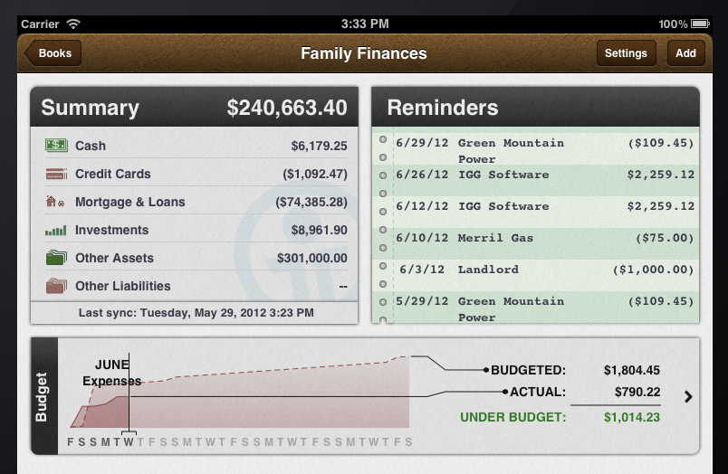
Top Portion of Overview Screen. The first screenshot I want to talk about is from the top portion of the overview screen:
At the top is the brown “leather binding” which holds the “pages” of your financial book with three buttons: dynamic navigation, Settings and Add. Then there is the Summary section which shows handy summations for your various accounts, assets and anything else you are tracking in iBank. Reminders, for v1.0, shows you scheduled income and bills. The Budget section is a brand new way of displaying how you are sticking to your budgets. Not only can you tell how well you are following your budget today, but you can also see when you’ll get back on budget if you are off. Notice that the “Budgeted” line has various jumps; these correspond to various bills that you are expecting for the month. The rest of the upward slope is determined by spending on non-scheduled items, like groceries, or household spending. I’m very excited about our new budgeting interface. It is, in my view, the best visual representation of a budget I’ve ever seen.
Transaction Editor. I want to talk about a different user experience that is ubiquitous throughout the app; it’s what we call “editors.” Editors are a way to, well, let users edit their data. In some iPad apps this is done via a popover or modal assistant. These are reasonable approaches and easy to implement, but they don’t provide a great experience. So we’ve gone the route of bringing up a custom “sheet” with customized keyboards, similar to what you find when editing cells in Numbers.app. For example, here is our editor for non-security related transactions:
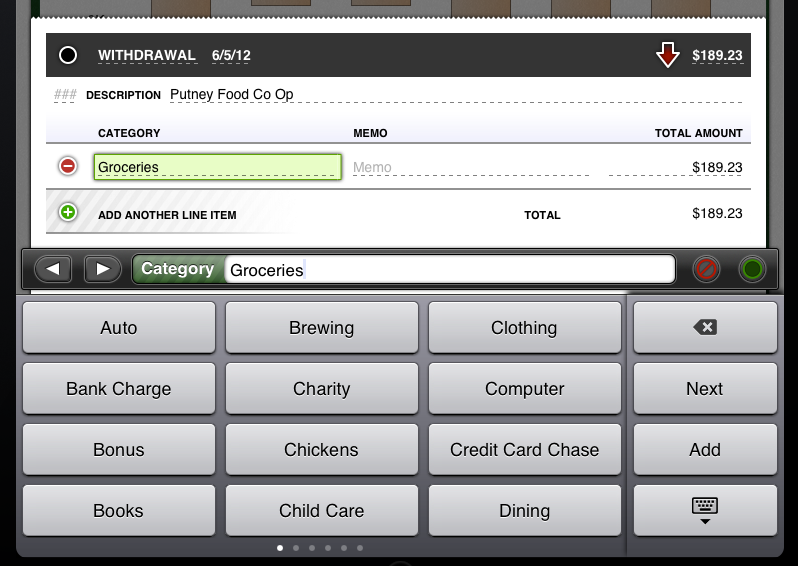
To edit any item in iBank you double-tap it. Editors work by tapping the field you want to edit (denoted by dashed underline) and by then tapping a value from the custom keyboard below. In this example, I’ve tapped category and then chose “Groceries” from the category keyboard. Please note how much easier it is to tap a category than to type out, “G r o c e r i e s”. The transaction editor dynamically presents just the information relevant to the transaction being edited. For example, if it’s a multi-currency financial book, fields for exchange rate and currency will appear.
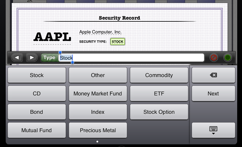
Security Editor. Here is another editor for securities (because remember, this app has full investment tracking capabilities):
We change the look and feel for each editor, but the principles and experience are the same. Editable items are dashed underlined and when possible we customize the keyboard for easy selection.
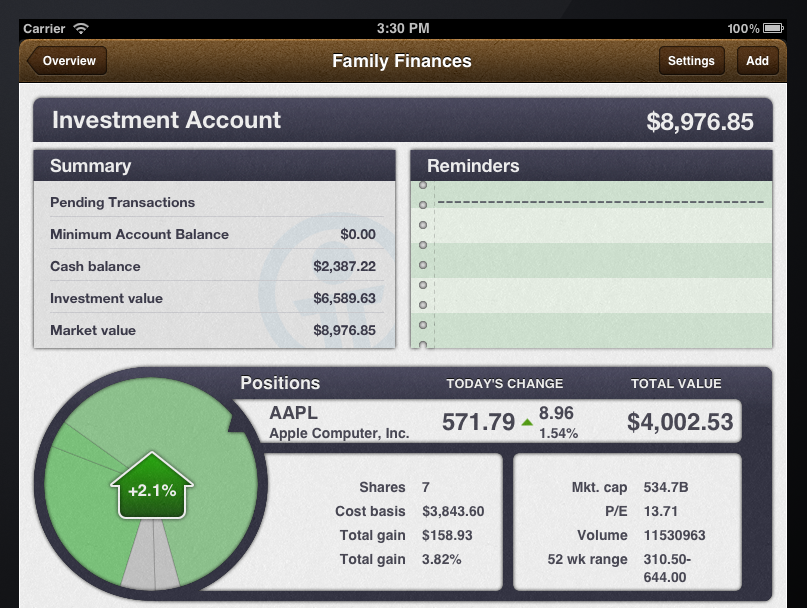
Current Positions Wheel. Providing an easy way for people with investments to see their current holdings and how they are performing is a must for a full-featured finance app. In addition to providing this information in a list, we also provide an interactive pie graph. Almost everyone who has played with that app has enjoyed interacting with this widget as it dynamically adjusts the angular velocity depending on the size of the pie wedge.
Whenever you look at an investment account, your current positions are displayed in our pie graph wheel. Each wedge of the pie graph can be selected by tapping it, spinning the graph, or tapping the big arrow in the middle. The size of each slice is a reflection of the value of the security. Green slices denote a gain, while red slices denote a loss for the day (grey is for no change). Notice that stats about your current holding are also shown (e.g. cost basis, gain, number of shares, etc.).
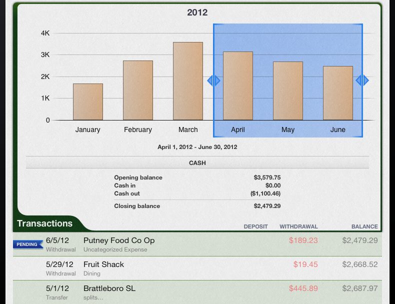
Interactive Bar Chart. The last major UI element I want to introduce is our interactive bar chart. The bar chart appears on almost every screen and is the primary way for getting at historical data. You can swipe it to scroll back in time and it will dynamically rescale the axes. By tapping individual bars or selecting a range of consecutive bars you can “drive” what data is displayed below:
In this case we are showing some cash flows stats and transactions for a three month range, April through June.
And with that, I’ve only begun to scratch the surface. I’ve left out major features and capabilities, including swiping pages to navigate, several other editors, the budget and spending screen, and other parts of the app. One only has so much time for a blog post when trying to wrap up the final details on a project of this size. So the big question is, when will it be released? I’m happy today that I can provide a better answer than our usual, “when it is ready.” We plan to submit it to the App Store toward the end of this month.
-Ian
- Banktivity 9.5 and Monthly Subscriptions - October 18, 2024
- Coming soon: Banktivity 9.5 - July 19, 2024
- Continuing Investments in Direct Access - February 26, 2024
No mention of how it will sync with my Mac or iPhone, which is one of the most important features for me…?
@Paul It will sync with iBank for Mac via WiFi or WebDAV. WebDAV can be used with some services from DropBox or free alternatives like CloudSafe.com. It can also be used as a complete standalone app for managing all of your finances without being tethered to iBank for Mac.
iCloud sync???
I’m happy to volunteer as a beta tester. I’m not looking for a free copy. I did beta testing for iBank Investor.
Ugh… I guess it was a mistake for me to set up and memorize a schedule of accounts to track categories of my business expenses. Custome keyboards are cool and all, but I’m thinking SWIPE, SWIPE, SWIPE, SWIPE, SWIPE, oh, there it is ‘3503 Safety Equipment’ might get a bit tiresome. ‘G r o c (autocomplete)’ might have been a better method?
Still, I’m very much looking forward to trying out this app. I love you guys, and I’m sure the app will rock. It does look great!
I am looking forward to this release but I would also like a little clarification on what it can do and what it can’t do.
I have both iBank mobile and iBank for mac. I find that the primary purpose of my computer is iBank and will frequently boot it up for the sole purpose of working on iBank. What I am looking for is a way to take the power of iBank and make it portable. Can iBank for iPad do the following:
1) Be able to run the same sorts of reports that iBank for Mac can do.
2) Be able to schedule transactions and confirm scheduled transactions.
3) Sync with iBank mobile (without having to boot up my computer)
A bit of topic, but I just hope that iBank 5.0 for Mac will have the same design. A bit tired of the little pink pigs style for saving accounts and so on…
I really like this iBank for iPad preview. Looks like more for grown up people 😉
When iBank for Mac/iPad/iPhone will be able to sync via iCloud, these will be great tools for our finances!
will iBank for iPad be localized in German Language? if not (yet) may I help with translation?
Will the budget feature be synced to the iPad from the Mac. If I set a budge on my Mac version will I have to set up another one on the iPad? Thanks, very excited for the update.
@Clayton Budgets do not sync. On the iPad side budgets are very different behind the scenes and thus syncing would not work well.
Hi Ian, thank you for this anticipation.
I hope that the mobile version will have a better report experience than the desktop version.
In my opinion, what it is missing is:
– line graph for category’s expenses with the possibility to compare different categories over time;
– automatically monthly report based on a template (e.g. income vs expenses repeated month by month);
– completely personalized report with the possibility to combine informations taken from different templates (tables, graphs, ecc.);
– folders for a better report organization.
If you will add these features I think that the perfect banking software will be created.
I would like to participate in the beta testing program, if you need some extra help.
Kind regards,
Lazzaro
Any news on the replacement for MobileMe? Only 22 days left and it is the feature that sold me on iBank.
Your are really the BEST! We can’t wait any more. So hurry up! Thank you for these news.
It is looking good, better than even iBank. I really hope the reports are going to be a little more fully fledged. Someone mentioned category sending over time, it’s staggering that pretty much only mint.com offers this in any useful way. Looking at a category spending over time with the budget line overlayed is a great way to see how you’re doing against plan.
Good luck with the release. Remember, don’t link to anything that might ask for money (drop box!).
Well…. Always great to see a company push out a new product that we cannot use! How about stopping the process of an iPad app and let’s back up and focus on the ability to sync with iCloud. IGG software is really stepping around this issue. We don’t care about your revenue stream of having to only sell via the app store. Just focus right now on getting is iCloud sync ability. Any products you make are considered a flop in my opinion. In fact, all revenue off of this “new product” should be 100% donated to charity until you do your job and add iCloud support not rather than later. Let’s fix this!!!!
In regards to the iCloud, WebDav, WiFi discussion…for those of us using the iPad version as our ONLY version, how will we go about backing up our data? The data is just too important to trust that the app or the iPad won’t crash and lose all my information. Thanks.
I have to admit up until this post I have been underwhelmed with the IPad app but this post has changed that. It looks to have a very impressive feature set and is worth the wait. I really hope some of these core features (Budgets and reports) are moved into iBank mobile and iBank for the Mac (and Synced). I can see myself using this app over the mac app until it is updated.
Really hope it has bimonthly (twice a month) capability by far the most important feature for me. I get paid bimonthly, I pay my loans bimonthly, all my transfers are bimonthly
Will this be iOS6 ready ?
Will this print checks over AirPrint?
Very excited!
Will it be available in french ?
The screenshots are attractive and functional. However, the lack of budget syncing is a deal breaker for me. My budget drives everything! If I were to purchase is app I would have to manually update my budget on my iMac and iPad. I think that is just plain stupid. Leaving out the syncing of the core of personal finance does not make any sense. Your explanations seem lean more towards excuses rather than solutions. I have repeatedly said that I would pay a premium $99 or more for a fully functional Mac/iPad app. Taking part of my finances on the road via the iPad app is a non-starter for me. I will pass on this app!
@Lindsay: I couldn’t agree more. I was very excited for this release…until I read that budgets won’t sync. Major bummer.
Very excited for this release!
IBank is the only reason I still turn on my MacBook so will be selling that when this comes out.
Love iBank so much I am actually planning to switch to a UK bank with OFX support.
Keep up the great work!
Love the look of the iPad app! Great work… Can’t wait to use it.
Another vote for iCloud/Dropbox sync of data with Mac app. Also, the ability to sync budgets between the iPad and Mac versions is a must!
I have been anticipating iBank for iPad from the day one of iPad launch and happy to see this. But why the UI style look so different from both iBank for mac and mobile? The IBank for iPad UI per se is nice, but I can’t see the reason for the present look.
There are lot of key points in this blog that made me re-think about purchasing the desktop version and the app. The major flaw for me is no support for syncing and backup via iCloud or DropBox. I cannot justify paying $60 for the desktop version and whatever the price is going to be iPad version. The iPhone version needs an overhaul. The technology has improved so much in iOS that there is no reason why you can really only can sync via wifi. The second for those who want to use the app as a companion app to the desktop, we must have the ability to use the same features and sync that data.
Intuit basically has abandon the iPad and has no real solutions, I would at least expect another vendor to step up and fill that gap and take it to the next level.
Guess I will have to stay with my Quicken for Windows running Windows XP in Parallels and remotely accessing.
@Tony: I totally agree with your post. It is very disappointing to see the potential that this developer has to satisfy a growing user base. Those of us who have invested in the Apple ecosystem are owners of the best desktop and mobile devices on the planet. We expect nothing less from any developer that chooses to write code for those devices. However, I am confident that the free market system will prevail in this matter. The developer that creates a fully integrated; cloud-syncable personal financial software suite for the iOS/OS X ecosystem will have millions of users beating a path to their doorstep!
@Lindsay: If the developer for MoneyWiz can figure it out to sync using icloud, I wonder how come this developer is late to the party. I really want to give them a chance and my money.
@Tony
I tried MoneyWiz a month ago. It’s well designed and i wanted my data closer during my hollidays. Therefore iggsoftwares are really THE BEST. So i’m counting down days before the release. I can’t wait any more.
I’ve been looking forward to this for a long time, but if I can’t sync the mobile transactions I enter on my iPhone to this new version on my iPad, then it’s utterly pointless for me. I really don’t care if it’s WiFi, iCloud, or something else, but it NEEDS to sync these two. If I need to re-enter all my cash transactions each time, then yeah… real bummer.
I’ve been anticipating this iPad release for a long time now, but the more I read and everything I see, I’m starting to think that this App is going to be something similar to Mint, which basically sucks. I guess that makes sense since IGG now has developers from Intuit. It’s hard to believe that with the advancement of the mobile platform, that we are all stuck with NOTHING still.
iBank desktop is, good at best, for main financial tracking. Compared to Quicken, it kinda sucks. iBank mobile is just straight-up archaic! As mentioned in an earlier post, with the advancement of iOS, why are we still stuck with an app that only lets us enter transactions?! We should be able to do so much more at this point. Their are actually apps that are free that do 10x the amount of this app. Crazy!!
When this iPad app is finally released and it’s nothing more than Mint, I’m gonna give up and go back to Parallels/Quicken. Sometimes I wonder if the IGG Developers actually use their own software. I don’t get why they don’t seem to see the issues that we bring to the table.
Seriously, still no sync via iCloud? With all due respect to your efforts, why are you even bothering to release this for the iPad?
Do you have something better than iCloud in the works that will not cost users more than $0?
By the way, the lack of iCloud sync would be a non-issue except for one thing: many people bought iBank because it supported effortless syncing (between desktop and mobile versions) via MobileMe. Now that iCloud has replaced MobileMe (as a superior syncing solution), you’ve decided not to support it – and suddenly your software is nearly worthless to those of us who rely on the mobile sync feature.
Jeff – I can only agree with you. Sadly I do not sense ANY inclination to address or even (really) answer this point from the ICG team
Here is a reminder and setup instructions on how to sync via the cloud:
http://qa.iggsoft.com/1995/ibank-cloud-syncing
Really pleased the iPad App has now been released as I’ve been following the development on this blog however it isn’t appearing in the UK app store yet. Do you know when it will be available here too?