In my previous post I went into some detail on the improvements we are making to budgets. In summary, we are allowing for users to set up for the most basic scenarios, while still providing ways to track more complex budgets. Past blog posts have also focused on how these changes are being integrated in iBank for iPad. Today I’m going to talk more about budgets, but I’m going to focus on what we’ve been doing for the Mac.
Currently, iBank 4’s budgets have three different views: one for basic budgets, one for envelopes, and one for reporting (and printing). This is cumbersome to say the least. If you aren’t using envelope budgeting (which is optional), then you have one view that provides zero value. If your preference is the basic view and you want to print it, then you have to click on the report view, adjust how that looks and print that. This setup has bothered me, and I’m glad to say we’ll be moving on to something better.
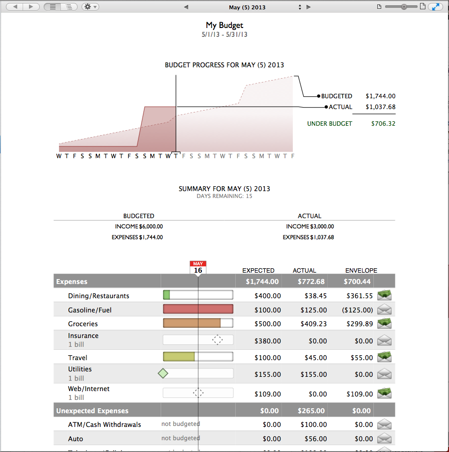
One of our main goals for improving budgets on the Mac was to create a single, integrated view that provides all of the information and functionality the user wants and needs, including printing and page layout support. Specifically, this new view needs to support drag and drop for envelope budgeting, editing of budgeted values, page layout for printing and general interactivity (e.g. “click to see more info”). We also need to present the data in a clear, concise way and make sure that for those who do not use envelope budgeting, there aren’t extra UI elements that clutter the view. From a broader perspective, we also wanted to improve budgets from the previous iteration. That is, what changes could we make to the UI and the data we display that will be more useful to customers? Below is a screen capture of our new budget view (still a work in progress):

One of the first things you’ll notice is at the very top is a date control — you can now easily see the budget for a week, month, quarter or year, and you can go back and forward in time to see your historical performance. The next element on the “page” is the the day-by-day progress view. We introduced this unique budget-graphing representation in iBank for iPad, and we’ve brought it to the Mac because it is that useful. You can see immediately if you are on budget or not, and if you are not, you can even see when you’ll be back on budget. Below that is summary information about your budget and finally, the category details. Again you’ll see we’ve borrowed from our iPad app, and astute readers might notice that when features are more functionally equivalent, they become easier to sync. You can also see that we now indicate whether or not bills are paid (solid vs. dashed diamonds) and the redness of the progress bar takes into account the current date of the budget period. For the category details section, if you do not use envelope budgeting, then last column doesn’t appear. (Please take note that while the functionality for the budgets is almost done, this UI is not considered final.)
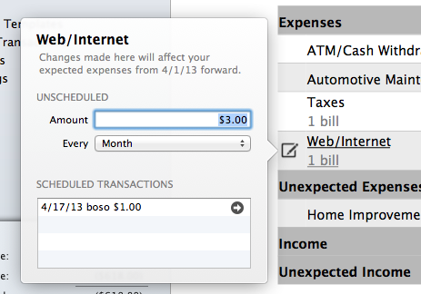
When you mouse over a row, you get an option to bring up a popover to edit or view a scheduled transaction:
The Budget Item popover lets you quickly change a budgeted amount (and we track your changes) or jump to a specific scheduled transaction, where it can be edited as well.
The entire underlying budget model and interface have gotten a complete makeover. We’ve tried hard to improve its functionality without sacrificing ease-of-use. We are very excited about our new budgets and look forward to putting them in the product. I can’t comment on any time frame about that yet, so thanks in advance for your patience. More news to come!
-Ian
- Banktivity 9.5 and Monthly Subscriptions - October 18, 2024
- Coming soon: Banktivity 9.5 - July 19, 2024
- Continuing Investments in Direct Access - February 26, 2024

Woof! I’ll be returning to iBank Mac as soon as this massive improvement is released. Thoughtful design that brushes away a major issue with the current product. Here’s hoping that we won’t have months to wait.
Two questions about the planned functionality: Are the “Expected” values show above prorated for the % of the budget period that’s been completed? Can’t tell from the example, but doing that would make the expected value much more useful.
And will we be able to enter budgets for one-time expenses (or thrice-annually events, etc.) or will we have to average monthly expenses per month, as iBank currently requires. Monthly “budget” values don’t mean much when you’re forced to track against averages.
Great stuff. Thanks for the post.
Jim
Ian – this looks great. One thing that is currently incredibly hard to do in most financial applications, including the mighty PC Quicken, is a net cash budget. It’s not useful for me to know every month I spent X on taxes, when it’s the same amount and almost always one of the highest spending categories.
I’ve worked around this in the past by creating convoluted nested categories, that calculate my net income (so you’ll see a budget for “Net Salary Mark”) but it doesn’t quite work because transfers to 401(k)’s act all odd, plus it’s a pain to set up and messes with other types of reporting. Additionally, budgets are really only useful for discretionary spending – my mortgage, car loan, maintenance etc are all fixed. It’s good to know over a long period of time what’s being spent in the categories, but not that useful for making day to day spending decisions.
Interested in your thoughts.
Will iBank be moving to support iCloud syncing in the next OS X release (Mavericks) later this year ?
Why is it the actual line on the budget above the budget line if you are under budget? It does this on the iPad app as well. This doesn’t t make sense. I’ve taken screen shots of the iPad app doing this.
Hoping the reporting date parameters will be customizable as well. at least month, quarter, YTD, etc.
I second the request for discretionary and non-discretionary broad categories.
The graph in this blogpost doesn’t show income?
Should also be able to report on when payments are expected (i.e. cash flow report.) so if I budget for a big insurance/tax payment in November it shows up that way when I run budget reports.
How do we get updates on progress, especially timing of the release. Not sure if I want to wait more than a month or two.
Along with these upcoming changes to the budgeting capabilities, is there any status on creating the ability to have reports that can do comparisons? I so very much want to be able to, for example, compare spending for a given period of time for that same period last year or last month. Or compare categories of spending for one period vs. another.
This seems to be a fundamental component to expense management / analysis and it would be a welcome addition to the iBank report suite.
Does the budget feature allow you to print a yearly budget so you can see all the budgeted amount in one column, then January spent, February spent, March spent, etc. I need a yearly document. Will this happen or does it and I’m not aware of it?
What is the status on this please? Same as Christina – I would also like the ability to see a monthly budget consolidated as an Annual budget if I choose to.
This blog post was made in May and no updates yet. Would be great to get some updates.
I am new to iBank and have couple of questions related to proper usage of budget for my case. Here is the situation:
1. I have a variable income every month. Therefore, my budgeted salary is not a constant.
I am not sure how to update this every month without disturbing previous month’s budgeted salary and,
2. I get paid on the 15th of every month. iBank’s monthly budget seems to work starting from the 1st of that month to 30th/31st….
But, for my budgeting purposes I would like to have it start from the 15th of a month and end on the 14th of next month
Any suggestions or work-around to handle this will be greatly appreciated!!
Thanks