The title says it all. As soon as we heard about iOS 7 at WWDC we knew we would need to overhaul our iOS apps. While I wish we could do everything at the same time, the truth is, we had to choose which app to update first and the answer was easy, iBank for iPad — our flagship iOS product. And the best part is, this is a free update for existing iBank for iPad 1.x users.
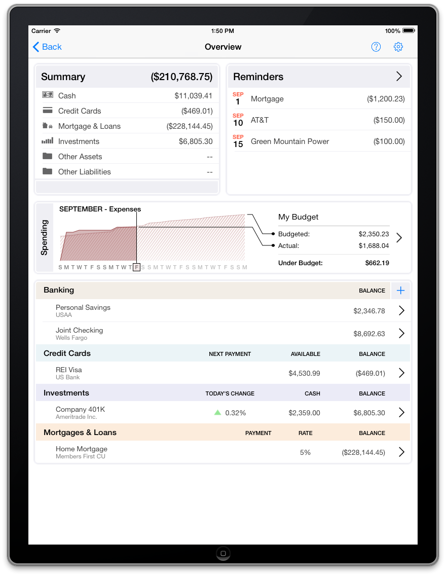
Compared to other updates, this one was a bit unique because it focused so heavily on UI changes. Almost every part of the current version (1.2.2 at time of writing) had to get a UI makeover. Gone is the skeumorphism of “leather books” and the heavy lines and shadows, welcome the clean, elegant and crisp:
We followed Apple’s lead and tried to focus more on the user’s content and less on the “chrome”. While we were doing such a major overhaul we seized the opportunity to add some refinement and polish that we originally wanted to tackle for the initial iBank for iPad 1.0 release. For example, the Add button is gone from the toolbar. Now, adding transactions and accounts and other items is done from buttons more closely associated with what you will be adding:
In the screenshot above, can you guess which element to tap to add a something? Right, the blue + sign. Can you guess what it adds? That’s right, a transaction. How did you know this? Because the + is right next to the list of transactions — we call this functionality by proximity. I know this isn’t a major feature, but nonetheless it’s some nice refinement.
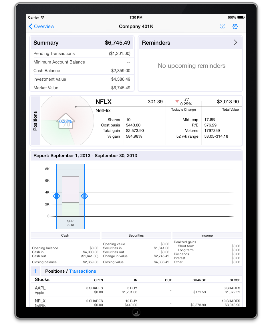
Practically every screen has been revisited for iBank for iPad 2.0. For example, here is the new investment account screen:
Although this refresh is primarily about a major UI refresh, we’ve also add some much improved syncing support. Soon you will be able to sync over your budgets and scheduled transactions from Mac. This has been one of our most popular feature requests and I’m happy to be able to announce it here. Please note, that the Mac version to support these new syncing capabilities has not been released yet. Be sure to check back at the blog soon for some big announcements :-).
Thanks for reading and be sure to check back again soon.
-Ian
- Banktivity 9.5 and Monthly Subscriptions - October 18, 2024
- Coming soon: Banktivity 9.5 - July 19, 2024
- Continuing Investments in Direct Access - February 26, 2024


Looks good. Will 2.0 be a free or paid update for people who have 1.0?
Yes, the upgrade is free for all users of iBank for iPad 1.x.
I’m not very clear on when this update is expected to be available. Any estimates?
Yes, it would be nice to have an estaimate on when iBank 2.0 will be released. the current version crashes on startup in iOS 7.
I’m curious as well. I think I saw in a tweet that the expected release was in “October” but I could be wrong about that.
One comment on this (aside from saying that they look great) – consider putting that “+” button on the right edge of the screen, rather than the left for transactions as well as for accounts. That improves internal consistency, and is the same as Mail and Safari as far as which side of the screen you go to to add or create a new item.
I look forward to the new UI changes, but please also add the possibility to edit and delete categories in this release, or at least in à near future. I have added my own categories and I want to get rid of all existing ones that are not applicable, since their precense makes it hard to remember/find which ones to use. This is one of the more important feature that I am missing.
For me, my two most wanted features have been to sync both budgets AND transaction templates from the Mac. In order to ensure no typo’s whilst entering payees, I tend to avoid making entries on the iPad due to the lack of transaction templates. Glad to learn 50% of my most wanted will be here soon. 🙂
How about adding ***any*** budgeting function into the iphone app? I just don’t understand it. The “spending” screen has always been useless–tells you how much you spent this month compared to last month, which may also have been way out of budget! We’ve been asking for this for years.
I was very excited about iBank for iPad when it was first announced a while ago. After reading the blogposts, etc. leading up to the release, I got the first day it came out with the expectation that I would be able to take it to my financial advisor. I was expecting that we would be able to generate reports similar to those available for iBank for Mac. Unfortunately, we are not able to generate reports. Are we going to be able to generate these reports in version 2.0? Are there any plans to implement reports? I have iBank for Mac, iBank Mobile and iBank for iPad. In terms of entering in transactions, I can use the register on iBank Mobile for any noninvestment transactions. So far, I feel as if iBank for iPad has been a waste of money for me as there is no point in using it as a mobile register and it is near useless in taking it to my Advisor in its current state.
Why so quiet on a release date?
Will you be needing beta testers?
Any chance we can get Dropbox syncing?
When, when when ?? So excited!
I had stopped using iBank for Mac, mobile or iPad…but adding Billpay is BIG–not just big…it’s HUGE! When this is released, you will ROCK! You will crush the competition. I am not going to convert back over to iBank until the new iBank for iPad 2 release. OLD quicken is way too convenient when it comes to all in one place…but SO DATED for Mac users. Thank you for making this change.
When will it be released?
Sounds great, but what about iBanks Mobile (iPhone). Will it get any love? The UI on iOS 7 is cringeworthy, and I’m a huge fan – already own iBanks for Mac and use iBanks Investor as well…
Just downloaded the new version.
I’m going to have to return to the previous version as the lack of colour make it difficult to use 🙁