I took my son skiing the other day, and while we were riding up the chairlift I wanted to check the time and see what notifications I might have. I started to fumble with my gloves to dig out my iPhone, then quickly realized the golden chairlift rule – those who take off gloves in a chairlift ski down with cold hands. So I didn’t get out my phone to check the time, see if Mom messaged me, or check how the markets were doing, but I wanted to.
During the summer I take advantage of the exceptional trail network near my home and take my horse out on trail rides. While I always take my phone with me on a ride, I almost never interact with it on a ride – it’s too easy to get distracted and become off balance should my horse spook. Sometimes I really want to see how far we’ve ridden, check the time, look at messages, look at investment performance, etc., but I don’t because I don’t want to fall. So my iPhone stays tucked away in a case attached to my belt.
Why do I bring up these winter/summer stories? To illustrate why I think Apple’s foray into the watch market is spot on. Fetching an iPhone 6 or 6+ from a pocket or purse is inconvenient frequently enough that many people would rather just glance at their wrist. Now I realize all of the various moments that it’d be so much easier to just glance at my wrist, and once you start paying attention too, you’ll realize there are a lot!
There are several broad financial questions we’d like to be able to answer easily and sometimes even throughout the day. Are my investments up or down today and by how much? How well am I sticking to my budget and can I afford this ACME widget? Similary, do I have enough money in my account to buy this? We thought an Apple Watch app that easily allows a customer to answer these questions makes perfect sense. So I’d like to introduce the iBank Watch app.
Before I go in to the details of the app, I want to talk a little about how Apple Watch apps are built. Third party developers get to build an app extension that displays on the Watch but is inseparable from its parent iPhone app. This works well for our case, as we want our Watch app tightly integrated with iBank for iPhone. In addition to the normal iBank Apple Watch app interface we are also implementing a Glance. Glances happen by just raising your wrist and flicking up from the screen that shows the time. Once you are in this Glance state, you can swipe left and right to see the apps that support Glances. Tapping the Glance screen launches the app in the Regular mode. This is true for iBank for iPhone and any other Watch apps that support both modes.
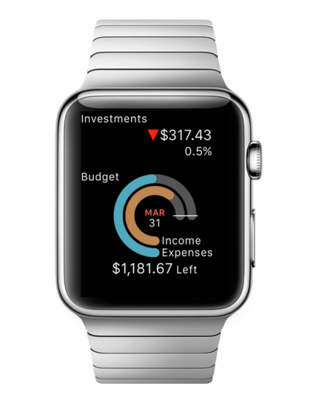
So let me now tell you about how our Apple Watch app will work. On the Glance screen we provide overall summary information about your finances. Specifically, you can see how your investments are performing and check your budget status. The budget area has a progress circle with inner and outer rings for income and expenses, and a today line to see how well you are sticking to your budget within the context of the month.
Here is the Glance view showing your daily loss (doh!) and budget status. Stock quotes are pulled when you launch the app (they are 20 minutes delayed) and continue to update every few minutes.
The Glance view of iBank Apple Watch app shows important information about how your investments are doing today and how well you are sticking to your budget.
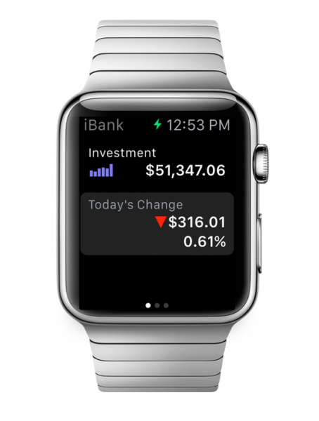
If you tap on the Glance view, you get a swipe-enabled paging view where each page shows one account. We show different information for investment and non-investment accounts. We also badge the screens with appropriate icons to help you quickly interpret what account you are looking at.
Here is an account called “Investment” in the regular app mode. It shows the value of the account and the daily change of your investments:
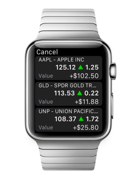
If you tap on this screen, you’ll get a list of your investment holdings for this account, along with information on how they are performing:
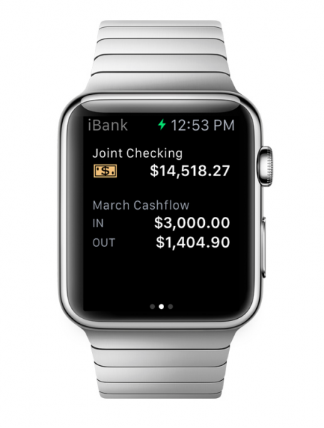
Here are screenshots of what some of the other account screens look like in the regular app mode:
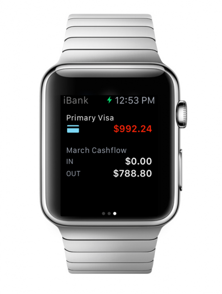
On non-investment account screens we show current balance and monthly cash flow in and out of the account.
A credit card account. The balance, because it’s money you owe, is red.
I know that some of you are probably thinking, “this is cool, but I have 35 accounts in iBank and I don’t need to see them all on the Apple Watch.” We have this solved – within the iBank for iPhone app, there is a new option under the settings view where you can choose which accounts (or none at all) will be made available on the Watch. This will allow people to just keep an eye on their most important financial information.
Our Apple Watch app extension will be available in iBank for iPhone 2.6 and we hope to have it ready to go as soon as the Watch is made available on April 24. This new extension is free as long as you own iBank for iPhone 2 or higher.
I’m really excited to get this new app (extension) to all of the future Apple Watch wearers out there!
-Ian
- Banktivity 9.5 and Monthly Subscriptions - October 18, 2024
- Coming soon: Banktivity 9.5 - July 19, 2024
- Continuing Investments in Direct Access - February 26, 2024
Call me stupid, and no doubt many will, but I don’t “get” why I need or would want an Apple (or other) Smart Watch. I stopped wearing a watch when I began carrying a mobile, then later, iPhone. Apart from the fact that it tells time just fine, my aging eyes can’t view a screen that’s much smaller than an iPhone 6.
I appreciate the interest some of IGG’s customers may have in an iBank app, but I’d really – and so, from comments I’ve seen elsewhere on your blog – improved functionality in the iPhone and iPad apps to bring them closer to the MacBook version. I say this because the new Microsoft Surface 3, which is comparable (OK, a bit larger) in size to the iPad, can run full versions of Quicken and other programs. Can we please have a fully functioning version of iBank for the iPad, and while you’re at it, an iBank for iPhone that provides some account totals, instead of merely an account list.
In the meantime, the watches I do have will remain in my drawer, as my iPhone is always with me and tells time “just fine.”
I am very concerned!!! There are still so many issues on the iBank versions on iPhone and iPad that haven’t been resolved yet and you guys are focusing on another new version. is anyone working on the existing versions to get things fixed?
I’m pleased that iBank is nicely out in front in this department. I’ll be getting an Apple Watch (cheapest model) for the kind of convenience Ian describes. The structure of Glances shown here appears smooth and logical and surprisingly extensive. Good call for the setting to narrow down the selection of accounts made visible!
Ian,
Not clear about if this new ‘account throttle’ will only affect the watch version or also the iPhone version. I have no current plans to get the watch, but would love to cut back on the number of accounts shown on my iPhone (updating them all each time I open the app takes forever.) For that matter, I’d also like the ability to only update online when I choose instead of automatically.
JB
I wonder about the prioritisation as well. Too many issue to be fixed and to improve upon with existing IGG products – why allocate resources to an unproven new gadget?
Personally I won’t be getting Apple Watch, at least not this year. I did with the iPad which was a mistake, the 2nd and 3rd gen models seem to have a much longer life.
However, I agree with a comments above that IGG focusing effort on this product is a bit concerning given the number of issues with the products already out there and even some unfinished features. ‘Save as’ edit feature for reports, folders for reports, toggle all accounts,, bulk edit payees, reports for the iPad version, sync issues are still persistent (I have to trash and reset my sync regularly), upcoming payments for loans and mortgages only showing the principle and not principle plus interest so you get the wrong amount among others. For example, the iWatch feature of which accounts to sync should be available for the iPhone version… maybe even the iPad version.
I love that IGG has become the best financial app on Mac, I’ve been using iBank now since version 2. With the subscription model the core products need to be kept up to date, healthy and competitive.
I could see where situations like what was mentioned in the post where one would like to have a watch to show you the current balances and budget progress, but like others have posted, I will be not be getting the Apple Watch. The primary reason, I do not have extra cash hanging around in my accounts. 🙂 I would like more flexibility within the core applications. Exporting data from the reports is ok, but building reports that would show what I would like to export and analyze in Numbers just is not easy to do. The Budgeting does not work very well and the schedule of transactions is not as flexible as it should be (no ability to schedule transactions on the last day/weekday/any day of the month is one example). I would love to hear more about how iBank it going to be improved and how we could help with the feedback.
I simply do not understand the eagerness to jump onto the latest gadget craze while the two applications that you have released are still in need of work. Oh yes, separate people from their money. How could I forget? There exists compatibility issues between iBank for Mac and iBank for iPhone (issues that result in the two not truly being genuinely in sync with one another – transactions categories available on one that are not possible on the other, for example), but here you are wanting to parade your latest efforts toward venturing into yet another app. I suppose the goal will be to release it before it is finished. Seems to be the trend. Too, it is an app for a silly gadget that pushes the definition of being overpriced into the stratosphere. Tiny screens for tiny minds I suppose. It would be different if you addressed customer issues with the extant offerings. If my work priorities were like yours, I would have been fired a longtime ago. Sorry if I sound pissed off. Perhaps it is because I am just that.
The jury is out for me on the watch. Much too small a screen. I’d rather see some of the “clunkiness” get fixed in iBank for the mac and it sure would be nice if there were an internet site that showed all the feature requests folks have submitted and some kind of time line for addressing those.
There are some unflattering reviews of the Apple Watch on Business Insider today:
http://www.businessinsider.com/apple-watch-reviews-are-bad-2015-4
I’m not trying to “DIS” Apple, but the Watch strikes me as a solution in search of a problem. For now, my iPhone meets all of my needs, and I can see it.
And another review from Joanna Stern of the Wall Street Journal, whose recommendation is “wait until next year”:
http://www.wsj.com/articles/apple-watch-review-what-the-apple-watch-does-bestmake-you-look-good-1428494694?mod=WSJ_hp_RightTopStories
Previously I was thinking that I was not going to get one, until I found out that it was covered by wellness reimbursement! I am looking forward to trying out the new iBank app for Apple Watch.
P.S. to my earlier post. It’s good to see that an update for the iPhone iBank has arrived and that, as Ian indicated, its settings now have preferences for the Apple Watch app. I especially like the option to compare spending with last month or with a budget on the watch. Also the easy way to choose which accounts will display on the watch. This is not to say I’m oblivious to the shortcomings others have mentioned in other iBank apps. But indications are good for the Apple Watch app. Now all we have to do is get Apple to make the watches and ship them!
I think its a very smart move by the developers – there is a massive media buzz about the watch, and being able to ride that wave means loads of free publicity for iBank, I’ve seen it listed in articles about best apps for the watch which is a massive boost. Not to mention that people who spend $1,000 on a watch may have a few investment accounts and probably won’t mind spending $10 on an app that helps them make the most of their new shiny toy. Bear in mind the developers aren’t charging existing customers for the watch extension, but it could bring in lots of new customers to iBank which will help fund further development.
While the current glances look nice and I think its great to see the developers working on new material, what really would be useful for me is the ability to add a new expense from the watch. Moneywizz has and to my mind it would make the watch extension more of a useful tool than a gimmick.
I feel like all developers are being moved to the watch app and iPhone app. It seems like the iPad app is not getting any attention anymore.
Nice blog.Thanks for sharing!