One of our longest-running feature requests has been support for a “dashboard” overview of your finances: a screen dedicated entirely to getting the big picture of your money. Like almost every feature we consider adding, the concept is simple, but the implementation gets tricky pretty quickly. For this particular idea, one of the immediate questions we faced was, what exactly do people want to see in an overview screen? After poring through documented requests, it became clear that most people wanted a summary of 1) their accounts, 2) upcoming bills and 3) recent spending.
Another long-standing request has been for an easier way to see summaries of individual accounts. For example, if you have a mortgage and want to see an amortization table in iBank, you need to make a report to do this; it should be easier. Similarly, if you have an investment account and you want to see your positions, you need to use a portfolio report. Well, we’ve solved these issues.
Today I’m pleased to show you two of the biggest new features we’ve been working on in iBank 5 — our new Overview page and individual account summary pages. Although we likely won’t make any large changes at this point, please note that the following screenshots are not final.
Overview Page
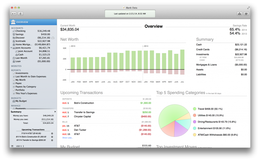
We’ve added a new “OVERVIEW” item to the source list. When you select this, you get a brand new view showing you the most important aspects of your finances:
As you can see, this screen breaks out the most critical parts of your financial information, including a new parameter not previously available in iBank: your savings rate. We also show net worth though time, account balances summary, upcoming transactions, spending, budgets and investments. This screen is easy to read and very printer-friendly. When you do print it, we page break where you expect and even bring over column headers on new pages.
Individual Account Summary Pages
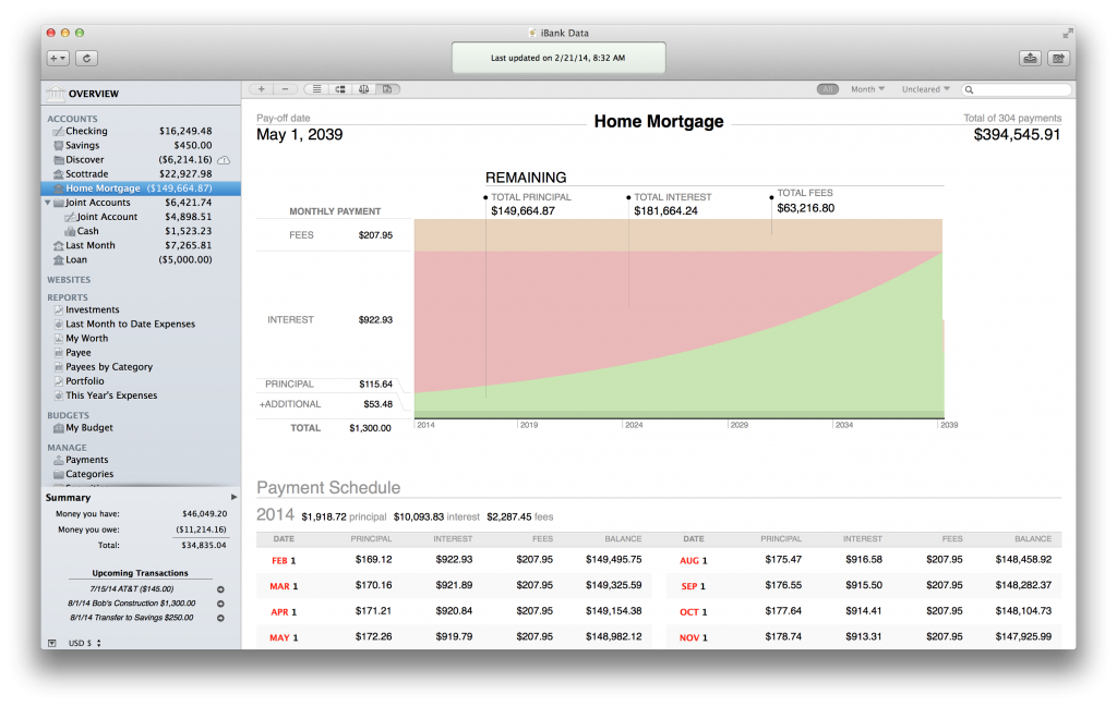
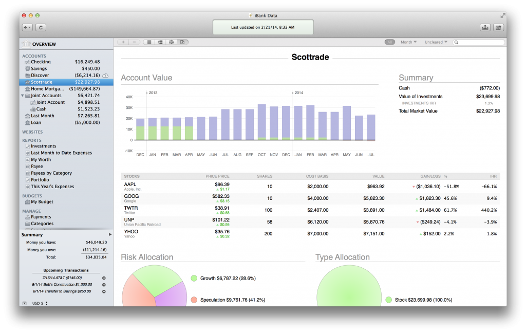
The Account Summary page is a new optional view for the selected account where we show the most important information. We’ve extended our “tab” buttons on the account scope bar:
Selecting the new “report” segmented button will get you a summary for the selected account. And in each summary, iBank customizes the data depending on what type of account you are viewing. For example, a loan account will show you a nice breakdown of the data specific to your loan. We also show a full amortization table so users no longer have to generate a report to do this.
For investment accounts, you can now take a glance at your holdings without making any reports, including data on IRR, cost basis, and gains and losses.
These screens have been under development for quite a while. I want to give a special shout out to the iBank Insiders group of power users who had special access to beta builds with these new features. Their feedback was invaluable and really helped us put some needed polish on these screens and better understand usability issues. So, “thank you, iBank Insiders!”
The new Overview and Account Summary screens will make their debut in iBank 5.2, alongside a number of important bug fixes and Yosemite support. This will be a free update to existing iBank 5 users as well. We think you’ll really love these new features; we see them as just the first step toward giving users more efficient, time-saving tools. We’ll continue to improve these as we learn more about what financial information people want to be able to see at a glance.
Thanks,
Ian
- Building the Future of Banktivity: Organizer Progress Report - October 17, 2025
- Filed Away Forever: Why We Built The Organizer - April 25, 2025
- Banktivity 9.5 and Monthly Subscriptions - October 18, 2024


This looks great! I’ve always missed this feature. I expect it will prove attractive to new users in the future and be a factor in retaining current ones. I can’t help but be curious about one thing: how is the savings ratio calculated? There isn’t a way to tag a variety of transactions as savings, and uses of other categories can cancel each other out. At present I have to use the memo line to identify savings. Does the ratio require the use of a parent category? Or is it simply the difference between income and expenditure?
This looks terrific! I can’t wait to try it out.
I agree this looks very nice and look forward to the new functionality. But please, PLEASE give your reporting engine some love. It’s still a far cry from what I could do within Quicken. I’m so glad I don’t have to deal with that awful buggy software and nasty company but as I’ve written in the past, your weakness is reporting. I’d be happy to give specific examples of what Quicken could do, iBank can’t.
Please listen to Andrew. The Reporting features need to be improved. Please . . .
Please, please listen to Andrew. I have just ditched quicken because I am totally done with windows but I am sorely missing the reporting and the intelligence in importing, both of which are very weak in iBank.
Ian,
This truly looks awesome and Im very excited about this feature! You cannot get this in our hands fast enough! I would not even want to make any additional change requests at this time until we can actually see this new feature and work with it. Great job to the IGG Team! While I don’t even want to mention this, I am actually beta testing the new Quicken ’15 for Mac. While you have a more robust feature set right now, I can say the Quicken folks are working very hard on the initial release and it looks like it could potentially be one to watch out for. They intend on getting all of the Quicken features in it after they release. Now is definitely the time to implement features users are wanting and at a rapid rate at Quicken plans to add new features very fast. Again, thanks for the new feature!!!!!
Sounds great. Is there any way we can import financial books created in iBank for iPad into iBank6 yet? This feature has been requested for years, and not being able to do so makes IBank for Mac unusable for me, having started out using the iPad version 🙁
Nice… Now, if you could fix up importing, I’d happily upgrade (Still on iBank 4)
The screenshot and ensuing dialogue remind me: while I like high-level summary charts, I’m still missing a way to get a bar chart that shows, for example, my groceries category month over month, so I can see how my spending changes over time.
It is great to have new more informative reports but when are you going introduce some basic options that allow the user to modify reports to meet individual requirements. There are times when I would prefer some report fields to be either hidden or not reported, either because the field is of no interest or it is a compromise worth having so that the report fits better on my screen or on a printed page. And for the same reason why cannot column widths of standard screens and reports be width adjustable? I have been asking this question of you since version 3! It is the only weakness in an otherwise great product I have been using ever since Quicken abandoned Apple.
So true, I use milliones and hundreds of millions because of denomination in my currency and it’s very hard to use
I too would like to see the introduction of more options for the user to modify report presentations. For example, a missing yet very basic feature is the ability to subdivided reported transactions into individual months covering a range of months (a quarter or year, for example). Currently, there is no possibility of subdividing a time range exceeding a single month into individual months (each with its own subtotal). It would be greatly appreciated if this feature were implemented. In iBank you have given the user so many wonderful features. It is just things that seem basic and common to essentially each of your competitors offerings have never made it into iBank. As a result I find it necessary to use multiple applications to cover all of the desired features for tracking my finances. Wish that this were not so.
Will 5.2 allow accounts to be created in Yosemite? Or will you have a update for Yosemite before 5.2? Right now it looks like 10.10 review 4 with iBank 5.1.1 will not allow me to create a new account.
Yep, Andrew had some great points. I too miss some of the Quicken features and would love to see those in your product. Thanks!
I agree that the reporting function needs more flexibility to 1) add and delete data columns as well as 2) to be able to sort data by different date ranges and 3) subtotaling within ranges. I have a lot of hidden accounts (a few dozen that are closed but I don’t want to delete from my file) and it would be nice to exclude those from the account list for reports – right now they are included in the list.
This looks fantastic, just what I’ve always wanted. With Quicken Mac debuting (I was on the beta for 5 months… it’s very disappointing), this iBank facelift is really great timing. Any news of a release date?
Ian, is there any possibility of your offering beta-testers of OSX Yosemite an early preview edition of iBank 5.x with the above features? I’d really like to test drive it before doing a full Yosemite ugprade. Thanks.
This looks awesome, when will it be available? I’m ready for the upgrade now!
I agree with the other Andrew and comments. More robust reporting is about the final thing that needs to be polished and then you have a perfect product. Entering entries, importing via banks etc works like a charm. The look and feel and UI are there. You have a wonderful product, keep it up.
Great improvement. Still missing the ability to sort transactions by when it posted in the bank. This continues to be very important at reconcile time.
Working good — but can you please draw a net worth line in the net worth bar chart? Little hard to average out the green assets and red liabilities.
I hav to completely agree with Allen. The major factor that keeps me from finally switching to iBank is weak reporting features. If you can fix this, I will buy it so fast, your head will spin. Please stop adding new features, and instead work on making the current ones better.